A Fine Brand: from ascii to awesome in 8 sweet months
The new version of Solutious.com went live this week as part of a larger effort to develop a brand for the company and the products I’m working on. I’ve been working with designers Adam Bognar and Andrew Simpson and I’m really excited about how it turned out. I thought it would be interesting to take a look at how the site and brand developed over the past 8 months.
Prehistory
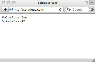
When I started the company in 2006, I put up what I thought would be a temporary homepage. I had an ongoing contract with a great company so I didn’t have an immediate need to update the site. Looking back, I probably had too many eggs in that one basket. It worked out okay, but the prudent choice would have been to spend a little time on business development regardless of the circumstances. In any case, the only information on the site for 2 years was the name of the company and a phone number.
October 2008, a rudimentary start
In 2008 I decided to shift the focus of the company from providing services to bootstrapping a product (more about that in a future post). I absolutely needed a website at this point and after a few months of intense research and prototyping I came up with this:
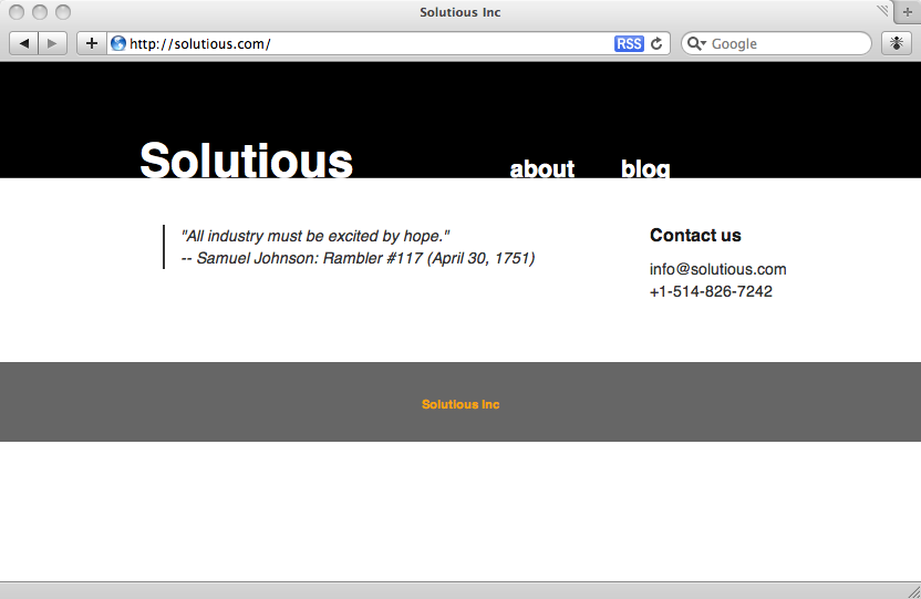
I was still heavy into product development so I had no content. There were no slogans and there was only a factual description of the company. I needed to put something on the homepage so I threw in a motivational Samuel Johnson[1] quote: “All industry must be excited by hope”. I hadn’t put much thought into it at the time, I simply thought it was interesting given the sombre tone of the economy, but as it turned out the spirit of that quote became the first kernel of the Solutious brand.
However, to say this design was an improvement over the stark yet earnest ASCII is a tough sell. It was more like a cry for help. I clearly required the services of a professional.
January 2009, the quick fix
That professional came in the form of Andrew Simpson. I hadn’t worked with Andrew before but we’d been friends for a while and I was impressed by his previous work. He was (and still is) incredibly busy as one of the founders of Rilli so I was fortunate to get some of his time.
I had a simple, two-pronged request: a quick fix and a plan for the future. I still had very little content for him to work with (and for some reason I decided to use a silly quote from Alistair Cockburn), so I was quite pleased with what he came back with.

I released the first public version of Stella around the same time and shortly after this design went up I began working on Rudy. You’ll notice the title on this homepage is “The Performance Testing Company”. That’s because my original focus was performance testing tools (I’ll talk more about the business side of things in that upcoming post). With the introduction of Rudy, a development and deployment tool, I removed the word “testing” and adjusted my approach to include the notion of human performance. Software shouldn’t just perform well at run-time, it also needs to perform well at development time.
March 2009, the prototype
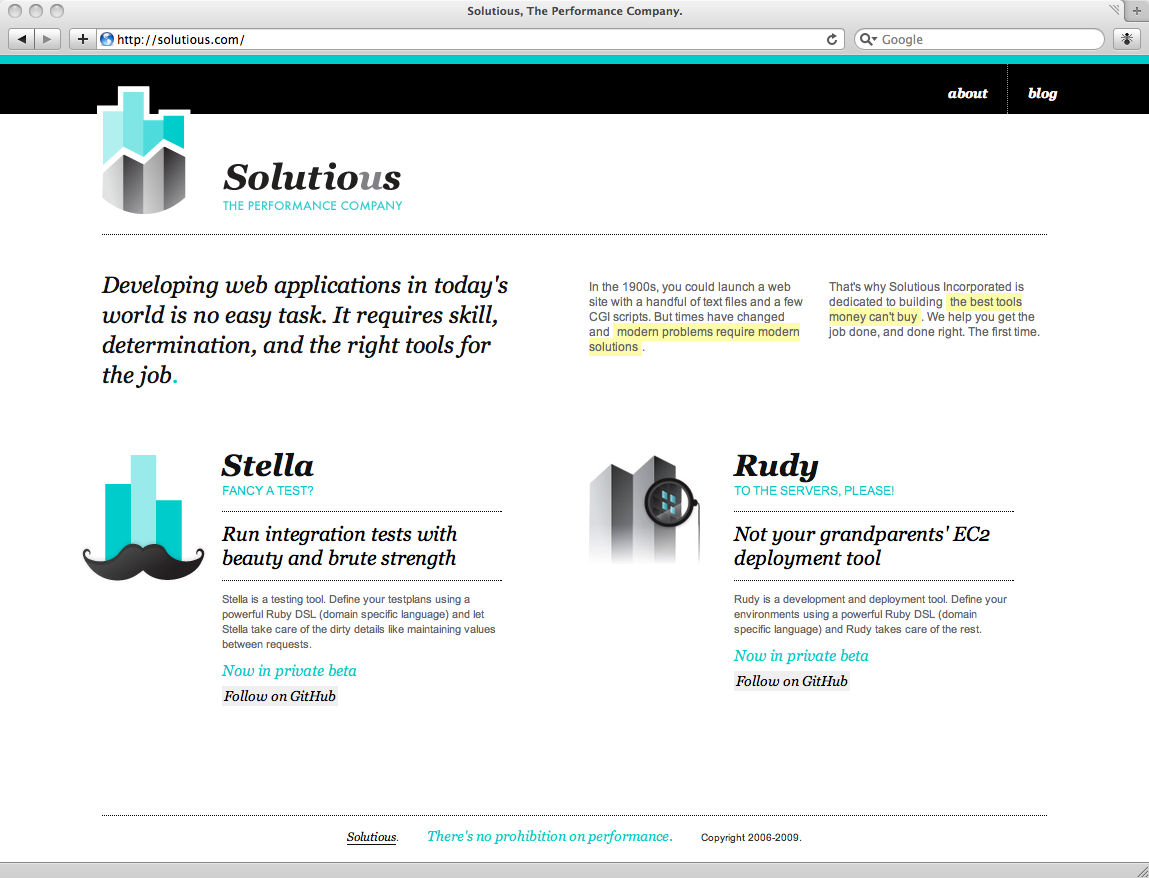
The project really started to take shape in March. I had a much better understanding of both the products and the direction of the company so when Andrew brought Adam Bognar on board there was a lot more content to work with. Adam has a tonne of branding experience so I was excited to have him involved.
We had a couple conversations over Skype and I sent them a motley collection of copy (“Developing web applications in today’s world is no easy task”), old-timey advertising slogans (“Good Natured Tools”, “World Famous Components”) and examples of early advertising. I even sleuthed out a turn of the (19th) century theme song. Shortly after they created and built the prototype.
I was pretty stoked at this point. We had the content, we had logos, and for the first time in this process we had some focus. I was envisioning a future for Solutious based on this design. But they weren’t done.
May 2009, A Fine Brand
About a month or so after we went live with the prototype, Adam sent me this:

I was blown away. This design says everything I want people to know about Solutious. On top of that, there’s a wealth of visual components that allows for all manner of flexible and dynamic content. This blog for example fits in perfectly and I’ll be able to bring in the product documentation too. Andrew suggested using sIFR to render the text components. I didn’t fully understand the value until I started looking at the templates myself. If I want to change a slogan, create a new title, etc… I can make those changes on the fly. The intermediary step of creating and uploading an image is gone. Once the dust settles I may convert some static components to images, but at this stage that flexibility to make changes is extremely valuable.
On Branding
Branding and brand development have a bad rap outside of design and business circles. Brands tend to be viewed as a mere interpretation, often a false one, of what a company or product actually is or does. That’s fair because there are a lot of dubious and/or misleading brands (Fernandez, I’m looking at to you), but it’s not the only interpretation. It’s also possible and even advantageous to align a brand with reality. This is particularly valuable for small companies and micro-ISVs because it’s a way to align one’s personal and professional goals.
Conclusion
I can’t give enough credit to Adam and Andrew for creating this honest and cohesive brand from my haphazard reference material[2]. I wasn’t sure what to expect when we started out. I certainly had no idea that the end result would be something that motivated me to bring the company to the next level. I hope they got as much value out of the process as much as I did!
It was a fun, non-linear, and surprising project. If I’ve ever been excited about and hopeful for the future, it’s now.
Notes
[1] I ran a tiny, underground t-shirt business in 2006-2007. By “tiny” I’m referring to the fact that I had only one design and by “underground” I mean to say that the only sales channel was me wearing it and random strangers stopping me to ask about it. The shirt was a drawing of Louis Riel (Canada’s preeminent historical rebel) but when I was in the United States I’d say it was Edgar Allen Poe. I had several other designs in the pipeline, including one of Samuel Johnson (who wrote the first english dictionary by the way). It was going to be a drawing of him smiling while reading the newspaper with text below that read, “Samuel L Johnson”. If you’re into t-shirts and you’re in Montréal, I highly recommend Blank.
[2] I did make one contribution to the design – a sketch of the Stella logo. Fortunately the end result looks much less like two whales kissing.
